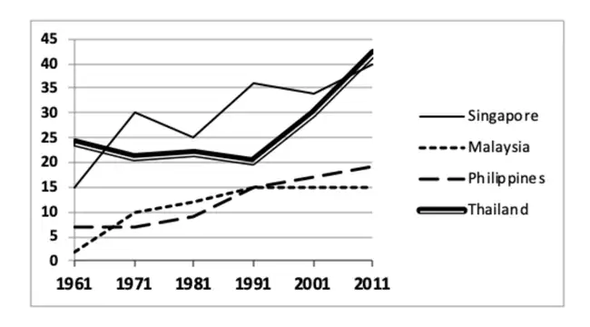
IELTS Writing Task 1 as a graph on the age of students in 4 different countries from 1961 to 2011 with full essay and assessment submitted to us by one of our students. Video of age of students IELTS graph https://www.youtube.com/watch?v=4LXp8L4iqmY Write a report on the age of students The graph above displays the proportion of university students in the 18-40 age bracket in 4 different countries from 1961 to 2011. Summarize the information by selecting and reporting the main features, and make comparisons where relevant. Source of visual data: Makkar IELTS IELTS Writing Task 1 on the age of ...
IELTS Writing Task 1 Graph on Age of Students + Analysis
Share This Post
About the Author
Related Posts


Your report on the graph was cut and pasted in the body of this post to avoid duplicate content. Please refer to the body of this post to access the report.
Thank you so much for writing a report on this graph on the age of students.
Feedback
1. In complete sentences, we should write: the Philippines, because it is the combination of various islands.
2. The most proportion has Thailand = Thailand had the highest / greatest / largest proportion of …
3. the less proportion had Malaysia = Malaysia had the lowest / smallest proportion …
4. You have given a fairly good overview of the graph in your introduction.
5. In your second paragraph, you’ve made a judgment on some improvement. Yet, we’re just observing an increase in the rate of older students registering for university education. This phenomenon is not necessarily an improvement.