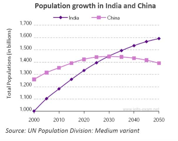
IELTS Writing Task 1 | Population Growth IELTS Writing Task 1 | Population Growth Instructions: The table, graph or bar chart below shows population figures for India and China since the year 2000 and predicted population growth up until 2050. Write a report for a university lecturer describing the information delineated in the graph. Intensifiers to Describe the Data Dramatically Gradually Moderately Rapidly Sharply Slightly Slowly Steadily Essayist: Arash The line graph demonstrates population figures for India and China since the year 2000 and predicted population growth up until 2050. The vertical axis indicates the total populations (in billions) and the ...
Home » IELTS Essay Writing Practice » IELTS Writing Task 1 | Population Growth

IELTS Writing Task 1 | Population Growth
Updated: by Dr. Mohammad Hossein Hariri Asl
Time to Read: 3 minutes | 473 Views | 2 Comments on IELTS Writing Task 1 | Population Growth
Share This Post
About the Author
Dr. Mohammad Hossein Hariri Asl is an English and Persian instructor, educator, researcher, inventor, published author, blogger, SEO expert, website developer, entrepreneur, and the creator of LELB Society. He's got a PhD in TEFL (Teaching English as a Foreign Language).
Number of Posts: 4243


The line graph demonstrates population figures for India and China since the year 2000 and predicted population growth up until 2050. The vertical axis indicates the total populations (in billions) and the horizontal axis shows the period between 2000 and 2050.
From 2000 to 2025, there was a gradual rise in both countries’ population and eventually, in 2030, the population of both countries was the same with the population of over one billion and four hundred million. There was an insignificant decline in the population of China from 2030 to 2050, however, at the same period of time, there was a considerable increase in the population of India from over one billion and four hundred million to one billion and six hundred million.
To conclude, the line graph illustrates that there has been an upward trend for the population of India in this period of time and it will be increased slowly in the future. On the other hand, the population of China will be decreased moderately after this period.
Dear Arash,
Thank you for submitting your IELTS report on population growth to us for assessment and evaluation.